
Bruce Mau “I'm interested in the moment when two objects collide and generate a third. The third object is where the interesting work is.”
Bruce Mau
Bruce Mau was born October 25th, 1959 in Sudbury, Ontario, Canada. Even in his early years, he knew he felt compelled to become an artist (much to his guidance counselor’s dismay), and was eventually accepted to the Ontario College of Art & Design. However, he dropped out before graduation, due to differences between his interests and the interests of the college. He instead joined the design group Fifty Fingers in 1980. From that point he jumped from firm to firm for several years, his resume including Pentagram in the United Kingdom, co-founding the Public Good Design and Communications in Toronto, working on I.D. magazine, and designing Zone Books (where he still serves as the creative director).
LIFE AND CAREER
Mau was born in Sudbury, Ontario. He studied at the Ontario College of Art & Design in Toronto but left prior to graduation in order to join the Fifty Fingers design group in 1980. He stayed there for two years, before crossing the ocean for a brief sojourn at Pentagram in the UK.
Returning to Toronto a year later, he became part of the founding triumvirate of Public Good Design and Communications. Soon after, the opportunity to design Zone 1/2 presented itself and he left to establish his own studio, Bruce Mau Design.
Zone 1/2: The Contemporary City, a complex compendium of critical thinking about urbanism from philosophers such as Gilles Deleuze and Paul Virilio, architects Rem Koolhaas and Christopher Alexander remains one of his most notable works.
From 1996 to 1999, he was the associate Cullinan professor at Rice University School of Architecture in Houston. He has also been a thesis advisor at the University of Toronto’s Faculty of Architecture, Landscape & Design; artist in residence at California Institute of the Arts; and a visiting scholar at the Getty Research Institute in Los Angeles. He has lectured widely across North America and Europe and currently serves on the International Advisory Committee of the Wexner Center in Columbus, Ohio.
In addition, Mau is an honorary fellow of the Ontario College of Art & Design and a member of the Royal Canadian Academy of Arts.
He was awarded the Chrysler Award for Design Innovation in 1998, and the Toronto Arts Award for Architecture and Design in 1999. In 2001 he received an Honorary Doctor of Letters from the Emily Carr University of Art and Design in Vancouver. He is also a Senior Fellow of the Design Futures Council.
In 1998, Mau produced a 43-point program called an Incomplete Manifesto for Growth that attempts to help designers and creative folks think about their design process. The manifesto has been widely circulated on the web since then.
At the Philadelphia Museum of Art, Mau exhibited his designs for books, graphics, and social projects. He received the Museum's Design Excellence Award in 2015. Mau received the Cooper Hewitt 2016, National Design Award for Design Mind, for his impact on design theory, design practice and/or public awareness.

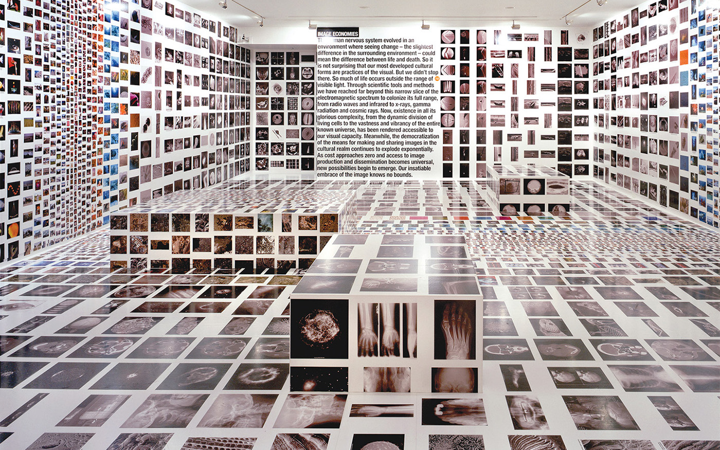
Massive change
“Massive Change” deals with 11 parts of today’s society: Urbanization, Movement, Information, The Image, Markets, Energy, Materials, Military, Manufacturing, Living, and Wealth & Politics. It suggests that design is so integrated into our lives that we rarely notice it. As Bruce puts it, “For most of us, design is invisible. Until it fails” (Massive Change). Perhaps the best way to describe “Massive Change” is a quote from Bill Buxton, of Buxton Design: “When we have problems interacting with technologies, it is a direct result of our not having asked the right questions in the design process. To be effective, we must shift our focus from the techno-centric to the human-centric” (Massive Change).

Contemporary works:
ASICS
BMD worked closely with ASICS to explore new ways to express the brand and rethink core elements while still using its iconic Spiral logo. The studio also helped to position ASICS as a lifestyle athletic brand while still staying true to its core performance heritage.
The new identity and brand system are inspired by the joy and positivity that sports bring to all aspects of life, as well as by the galvanizing spirit of the athletes who drive the energy of ASICS. The global brand refresh redefines how contemporary design can be applied to a heritage brand to convey a cultural and emotional message to consumers.
BMD worked across all touch points on the project, including core packaging guidelines, graphic and photographic language, a footwear style guide, a brand book, and a custom typeface developed in collaboration with Kontrapunkt.


Stellar
Stellar is a high-performance makeup brand that features addictive colors and sensual textures. It delivers all skin colors, with a particular focus on medium tones. The line features a full range of products that includes foundations, concealers, loose powders, blushes, lipsticks, and mascaras.
Taking visual inspiration from the cosmos, the brand identity and name allude to starry constellations. The word mark includes a dot that echoes both the North Star and a beauty mark. The colors used, reflect the inclusive nature of the brand. Black and white represent night and day while a secondary opalescent palette vibrates across the full spectrum of light. Guidelines ensure product photography and model photo shoots reverberate the effortless, confident, and bold brand ethos of Stellar.
Working with the client, BMD developed all brand touchpoints—positioning and story, name, visual identity, website, packaging, campaign photography, and collateral—from the onset all the way to a successful launch across North American Sephora stores.


Sonos
In 2011, as electronics innovator Sonos prepared to launch a new game-changing product, they retained Bruce Mau Design to help rethink the Sonos brand identity. After establishing an evolved wordmark and a new look and feel, BMD implemented this revitalized identity across touch points, design packaging, point of sale displays, retail collateral, special event graphics, website modules, user interface and a multitude of other digital applications. The new identity helped reposition Sonos from a technology brand beloved by "in the know" audiophiles to a company of broader appeal, focused on experience and originality.
More recently, as of 2014, the business has grown exponentially and numerous competitors have entered the market as wireless audio becomes more commonplace. Together with Sonos, we assessed the initial visual identity and determined that we needed to push harder to signal Sonos’s leadership, relevance, and dedication to the music experience.
This new iteration of the Sonos visual identity advances the idea of the modern music experience—an idea that is not singular or monolithic, but rather a rich array of expression. Performance imagery from Sonos Studio, new product photography and the introduction of three versatile graphic tools deliver a creative and variable language that still provides the stability of a recognizable system.
The identity launched internally with a BMD-designed brand video and is now making its way to the public. Currently, the brand can be seen in retail shops, trade show displays, retail collateral, the Sonos app and startup screen, and communications across national and international borders. BMD opened a second studio in Los Angeles in early 2014 to spearhead this relaunch and to work on ongoing brand design initiatives with the Sonos team.


OCAD University
In 2011, OCAD University, Canada's preeminent art, and design school sought a new visual identity that would reflect the 135-year-old institution's desire to move quickly into the future. The Bruce Mau Design team worked collaboratively with OCAD U staff in an intensive research phase and gathered additional input from OCAD U students and alumni. We felt that the visual identity needed to be a true reflection of OCAD as an inclusive, vibrant and vital institution built on creativity, risk, and innovation.
The result of our efforts was a dynamic and modular identity, which we introduced in a brief 2-minute video. Each year, the school invites a select group of graduating students to design a logo within the basic window framework, meaning that the emblem changes annually. As OCAD U grows and matures, a library of identities will emerge, with records of ideas and aesthetics gathered over time. The identity was named among the "Best Brands of 2011" by Fast Company and was the recipient of a Core77 Design Award.
In 2014, BMD collaborated again with OCAD to redesign their website. Like the visual identity, the limited pallet of black and white for typography and user interface elements creates an environment for imagery to stand out. The design takes into consideration the large, diverse and creative group of site contributors while also utilizing contemporary web standards and exceeding accessibility requirements.


